Introductions
Welcome! Below you’ll find all slides and instructions for the hands-on activities being held throughout the day. The site will remain up well after the event so you can refer back to the material at any time.
Prerequisites
All attendees must have the NativeScript CLI installed, and all system requirements in place to develop for either iOS or Android. If you haven’t already, complete the installation instructions using the link below.
TIP: If you run into issues completing the setup instructions, try joining the NativeScript Slack and asking questions in the #getting-started channel.
Additionally, please also download and install Visual Studio Code, and then install the editor’s NativeScript extension. You’ll be using NativeScript’s Visual Studio Code extension as you complete this guide.
What is NativeScript?
Below please find slides describing NativeScript:
The NativeScript CLI
Now that you have the basics down, let’s look at how to actually build NativeScript apps.
Exercise 1: Creating an app
Navigate to a folder you’d like to store apps in as you go through this workshop, and then run the following two commands.
tns create HelloWorld --ng
cd HelloWorld
Exercise 2: Running your app
You can use the tns preview command to run NativeScript apps in the {N} Companion apps.
For Android, you can download the apps from:
For iOS, you can download the apps from:
Alternatively, you can perform the builds locally. To do so, use the tns run command to run NativeScript apps. If you’d like to complete this workshop on iOS, run the following command.
tns run ios
And if you’d like to complete this workshop on Android, run the following command instead.
tns run android
Exercise 3: Making some changes
Open your app/item/items.component.html file and change the title attribute of the <ActionBar>.
Debugging NativeScript apps
Together we’ll go through the instructions to debug NativeScript apps in Visual Studio Code.
Project setup
The files for this part of the workshop are in the /warmup folder. Clone the repo and navigate to its /warmup folder by running the following commands.
git clone https://github.com/NativeScript/workshop.git
cd workshop/warmup
npm install
Next, run the project in the preview app.
tns preview
or, run the project in an emulator using one of the commands below.
tns run ios
Or
tns run android
Lesson 1 - UI
In this lesson we are going to familiarize ourselves with some of the most commonly used UI components in NativeScript.
For this exercise we will use the contents of the app/profile folder, which already contains some pieces of the app that we need.
If you are using Playground then you should head to: https://play.nativescript.org/?template=nsday-profile.
If you open profile.component.ts you will notice that our component has an attribute profile with some populated values. In the next few steps we will create a screen that will allow us to display and edit these values.
Here are some examples of UI components:
<Label text="name"></Label>
<TextField hint="your name here" text="Jack"></TextField>
<Switch checked="true"></Switch>
<DatePicker [day]="2" [month]="2" [year]="2002"></DatePicker>
<Slider [minValue]="0" [maxValue]="10" [value]="3"></Slider>
<Button text="Do Something" (tap)="clear()"></Button>
Attribute binding
The above example uses hardcoded values, but you can also use one way binding (with [] around the attribute you want to bind to) to display the values in the profile.
For example:
<Label [text]="profile.name"></Label>
<TextField [text]="profile.name" hint="name"></TextField>
Events
UI Components include events to handle common user interactions. A component can handle events such as: tap, doubleTap, pinch, pan, swipe, rotation, longPress, touch. To leverage them, use the (eventName) notation.
For example:
<StackLayout (longPress)="clearForm()">
  <Label text="Action:" (swipe)="printDirection($event)"></Label>
  <Button text="Do Something" (tap)="doSomething()"></Button>
</StackLayout>
Exercise: Use UI components
Exercise: Use Label, TextField, Switch, DatePicker, Slider, Button
Recreate the below UI and bind the input components to the profile attributes.
Additionally, make sure that the two buttons call save() and clear() respectively.
HINT To make a TextField password friendly use secure="true".
Edit profile.component.html and have fun.
NOTE: Your goal at this point is just to get the initial values of the
profileproperty to show up. If you change the values of the form fields and you don’t see those changes when you hit Save don’t worry; we’ll tackle that in the next section.
<ActionBar title="Profile" class="action-bar">
</ActionBar>

<TabView selectedIndex="0" >
  <ScrollView *tabItem="{title:'UI Components'}">
    <StackLayout>
      <Label text="Name:"></Label>
      <TextField
        [text]="profile.name"
        hint="name">
      </TextField>

      <Label text="Password:"></Label>
      <TextField
        [text]="profile.password"
        hint="password"
        secure="true">
      </TextField>

      <Label text="Angular Pro:"></Label>
      <Switch
        [checked]="profile.angularPro"
        class="switch"
        horizontalAlignment="center">
      </Switch>

      <Label text="Date of Birth:"></Label>
      <DatePicker
        [day]="profile.dob.getDate()"
        [month]="profile.dob.getMonth()+1"
        [year]="profile.dob.getYear() + 1900">
      </DatePicker>

      <Label text="Coding power:"></Label>
      <Slider
        [value]="profile.codingPower"
        [minValue]="0"
        [maxValue]="10"
        class="slider">
      </Slider>

      <Button text="Save" (tap)="save()"></Button>
      <Button text="Clear" (tap)="clear()"></Button>
    </StackLayout>
  </ScrollView>

  <GridLayout *tabItem="{title:'DataForm'}" rows="*, auto, auto">
    <!-- http://docs.telerik.com/devtools/nativescript-ui/Controls/Angular/DataForm/Editors/dataform-editors-list -->
    <RadDataForm [source]="profile" row="0">

    </RadDataForm>
    <Button text="Save" (tap)="save()" class="btn btn-primary" row="1"></Button>
    <Button text="Clear" (tap)="clearForm()" class="btn btn-primary" row="2"></Button>
  </GridLayout>
</TabView>
Two-way binding
One-way binding is not particularly useful for input forms. This is where [(ngModel)] comes in handy.
Each of the input components you used a moment ago allows you to use [(ngModel)] to configure two-way binding:
<TextField [(ngModel)]="email" hint="your name here"></TextField>
<Switch [(ngModel)]="optIn"></Switch>
<DatePicker [(ngModel)]="dob"></DatePicker>
<Slider [(ngModel)]="size" [minValue]="0" [maxValue]="10"></Slider>
Exercise: Two way binding
Exercise: Two-way binding
Update all input components to use two-way binding. Test it by clicking the Clear and Save buttons and see what happens.
NOTE: To keep an eye on the slider value, print it in the label above it:
<Label [text]="'Coding power:' + profile.codingPower"></Label>
<ActionBar title="Profile" class="action-bar">
</ActionBar>
<TabView selectedIndex="0" >
  <ScrollView *tabItem="{title:'UI Components'}">
    <StackLayout>
      <Label text="Name:"></Label>
      <TextField
        [(ngModel)]="profile.name"
        hint="name">
      </TextField>

      <Label text="Password:"></Label>
      <TextField
        [text]="profile.password"
        hint="password"
        secure="true">
      </TextField>

      <Label [text]="'Angular Pro: ' + ((profile.angularPro) ? 'Yes': 'No')"></Label>
      <Switch
        [(ngModel)]="profile.angularPro"
        class="switch"
        horizontalAlignment="center">
      </Switch>

      <Label [text]="'Date of Birth: ' + profile.dob.toLocaleDateString()"></Label>
      <DatePicker
        [(ngModel)]="profile.dob">
      </DatePicker>

      <Label [text]="'Coding power:' + profile.codingPower"></Label>
      <Slider
        [(ngModel)]="profile.codingPower"
        [minValue]="0"
        [maxValue]="10">
      </Slider>

      <Button text="Save" (tap)="save()"></Button>
      <Button text="Clear" (tap)="clear()"></Button>
    </StackLayout>
  </ScrollView>

  <GridLayout *tabItem="{title:'DataForm'}" rows="*, auto, auto">
    <!-- http://docs.telerik.com/devtools/nativescript-ui/Controls/Angular/DataForm/Editors/dataform-editors-list -->
    <RadDataForm [source]="profile" row="0">

    </RadDataForm>
    <Button text="Save" (tap)="save()" class="btn btn-primary" row="1"></Button>
    <Button text="Clear" (tap)="clearForm()" class="btn btn-primary" row="2"></Button>

  </GridLayout>
</TabView>
Theme
Now that we have the profile page doing something sort of useful, let’s make it look a little bit better.
The good news is that NativeScript comes with many built in themes.

Most of the standard UI components come with styles that you can use for quick styling improvements.
Text-based components can use:
text-primary,text-muted,text-dangerto change the text color,text-center,text-left,text-rightto change the alignment of the text,text-lowercase,text-uppercase,text-capitalizeto apply text transformation
For example:
<Label text="Name" class="text-primary text-right"></Label>
<Label text="Email" class="text-danger"></Label>
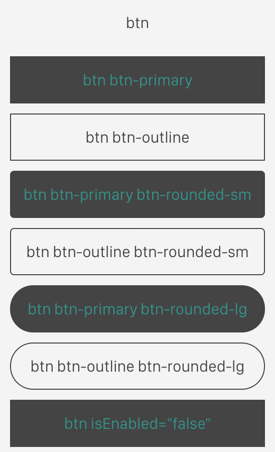
Buttons can use:
btn,btn-primary,btn-outline,btn-active- to change the general stylebtn-rounded-smandbtn-rounded-lg- to make the buttons roundedbtn-blue,btn-brown,btn-forest,btn-grey,btn-lemon,btn-lime,btn-ruby,btn-sky- to change the primary color (this only works in conjunction withbtn-primary)
For example:
<Button text="Primary" class="btn btn-primary"></Button>
<Button text="Outline" class="btn btn-outline"></Button>
<Button text="Orange" class="btn btn-primary btn-ornage"></Button>
<Button text="Rounded Grey" class="btn btn-primary btn-grey btn-rounded-sm"></Button>
Other components can use
action-bar- for the default<ActionBar>stylingswitch- for the default<Switch>stylingslider- for the default<Slider>styling
Margins and padding
You can use predefined styles for margins and padding.
Use m for margin and p for padding. Then optionaly add:
-t: top-b: bottom-l: left-r: right-x: horizontal (i.e. both left and right)-y: vertical (i.e. both top and bottom)
Finally add the size: 0, 2, 4, 5, 8, 10, 12, 15, 16, 20, 24, 25, 28, 30
For example:
<StackLayout class="m-x-10 p-5">
  <Label text="name" class="m-l-10"></Label>
  <Button text="Go" class="btn btn-primary p-20"></Button>
</StackLayout>
Note: To read more about themes, go to the NativeScript theme docs.
Exercise: Theme
Exercise: NativeScript Theme
Step 1
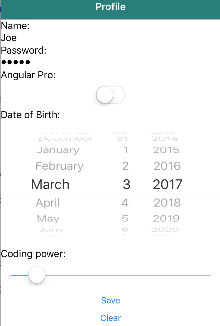
Update the UI to make it look more like the one in the picture below.
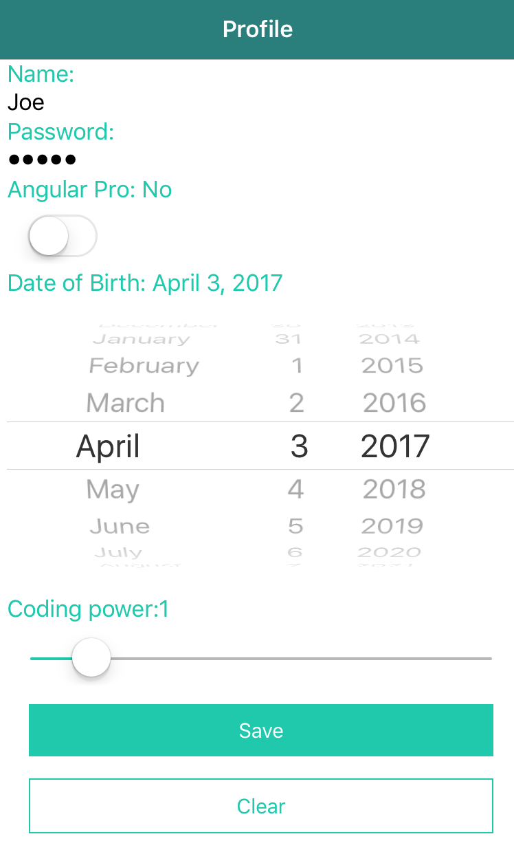
HINT 1 You may need to update the margin on the StackLayout, so that the UI components don’t stay too close to the edge of the screen.
HINT 2 If you are working with a small screen, you may need to add <ScrollView> around the <StackLayout> to allow the user to scroll in the screen. Like this:
<ScrollView>
  <StackLayout>
    ...
  <StackLayout>
</ScrollView>
<ActionBar title="Profile" class="action-bar">
</ActionBar>

<TabView selectedIndex="0" >
  <ScrollView *tabItem="{title:'UI Components'}">
    <StackLayout class="form m-l-5">
      <Label text="Name:" class="text-primary"></Label>
      <TextField
        [(ngModel)]="profile.name"
        hint="name">
      </TextField>

      <Label text="Password:" class="text-primary"></Label>
      <TextField
        [(ngModel)]="profile.password"
        hint="password"
        secure="true">
      </TextField>

      <Label [text]="'Angular Pro: ' + ((profile.angularPro) ? 'Yes': 'No')" class="text-primary"></Label>
      <Switch
        [(ngModel)]="profile.angularPro"
        class="switch"
        horizontalAlignment="center">
      </Switch>

      <Label [text]="'Date of Birth: ' + profile.dob.toLocaleDateString()" class="text-primary"></Label>
      <DatePicker
        [(ngModel)]="profile.dob">
      </DatePicker>

      <Label [text]="'Coding power:' + profile.codingPower" class="text-primary"></Label>
      <Slider
        [(ngModel)]="profile.codingPower"
        [minValue]="0"
        [maxValue]="10">
      </Slider>

      <Button text="Save" (tap)="save()" class="btn btn-primary"></Button>
      <Button text="Clear" (tap)="clear()" class="btn btn-outline"></Button>
    </StackLayout>
  </ScrollView>

  <GridLayout *tabItem="{title:'DataForm'}" rows="*, auto, auto">
    <!-- http://docs.telerik.com/devtools/nativescript-ui/Controls/Angular/DataForm/Editors/dataform-editors-list -->
    <RadDataForm [source]="profile" row="0">

    </RadDataForm>
    <Button text="Save" (tap)="save()" class="btn btn-primary" row="1"></Button>
    <Button text="Clear" (tap)="clearForm()" class="btn btn-primary" row="2"></Button>

  </GridLayout>
</TabView>
Step 2
Open app.css and change the imported style to each of the values below to see which one you like the most:
aqua.cssblue.cssbrown.csscore.dark.csscore.light.cssforest.cssgrey.csslemon.csslime.cssorange.csspurple.cssruby.csssky.css
(Bonus) - Use the NativeScript Themebuilder tool to create your own theme
Build your own theme using the NativeScript theme builder. This cool tool lets you view changes in a web browser, download a file, and style your app with a custom CSS file. Try building a patriotic theme with your flag’s colors, then download it to the root folder of your app. To see your theme, edit app.css to use the core theme and your new custom theme, like this:
@import 'nativescript-theme-core/css/core.light.css';
@import '~/custom.css';
Make something beautiful!
Animations
Adding animation to your app can really enhance its attraction and usefulness. There are several ways to add animation:
- Leveraging Angular-style animation
- Use NativeScript’s built-in animation library
- Use Animate.css
- Use CSS keyframe animation techniques
- Use Lottie (AirBnB’s library) or Keyframes (by Facebook) animations
- Use a community-generated animation plugin
Let’s work with keyframe animations to give you a feel for how animations work in NativeScript apps.
Exercise: Animations
Exercise: Animations
Enhance the slider so that when you slide it to a value greater than 7, its color changes and the label above it expands. To do this, you need to leverage the Angular bindings we learned about above.
Give the slider a class so that we can style it in the css, and bind the class.danger-slider property to the value profile.codingPower > 7:
class="slider"
    [class.danger-slider]="profile.codingPower > 7"
Then, edit the Label above the slider to expand when the slider value is more than 7 by giving it a class name that is bound to that value:
[class.zoom]="profile.codingPower > 7"
Take a look at profile.component.css to see how the keyframe animation is invoked.
<Label [text]="'Coding power:' + profile.codingPower" class="text-primary" [class.zoom]="profile.codingPower > 7"></Label>
<Slider
  [(ngModel)]="profile.codingPower"
  [minValue]="0"
  [maxValue]="10"
  class="slider"
  [class.danger-slider]="profile.codingPower > 7">
</Slider>
.danger-slider {
  background-color: red;
}

.zoom {
  animation-name: zoom;
  animation-duration: 2s;
}

@keyframes zoom {
  from { transform: scale(0.5, 0.5) }
  40% { transform: scale(1.6, 1.6) }
  to {  transform: scale(1.0,1.0) }
}
(Bonus) - Change the animation to spin, instead of zoom.
Instead of zooming, make the label spin around, just for practice. Hint, both profile.component.html and profile.component.css need to be edited.
<Label [text]="'Coding power:' + profile.codingPower" class="text-primary" [class.spin]="profile.codingPower > 7"></Label>
<Slider
  [(ngModel)]="profile.codingPower"
  [minValue]="0"
  [maxValue]="10"
  class="slider"
  [class.danger-slider]="profile.codingPower > 7">
</Slider>
.danger-slider {
  background-color: red;
}

.spin {
  animation-name: spin;
  animation-duration: 2s;
}

@keyframes spin {
  from { transform: rotate(-30) }
  40% { transform: rotate(420) }
  to {  transform: rotate(0)}
}
NativeScript UI
NativeScript comes with an additional FREE UI library called NativeScript UI it comes with a set of great components like: ListView, SideDrawer, Calendar, DataForm, Gauges and AutoComplete.
You can find the Angular Docs for these components here
Using NativeScript UI to a project
For today we will focus on one of the components DataForm.
You nativescript-ui-dataform should already be installed in the project.
So, there is no need to run a separate npm install.
It allows you to construct nice looking entry forms with all the styling and eye pleasing UX purely through configuration.
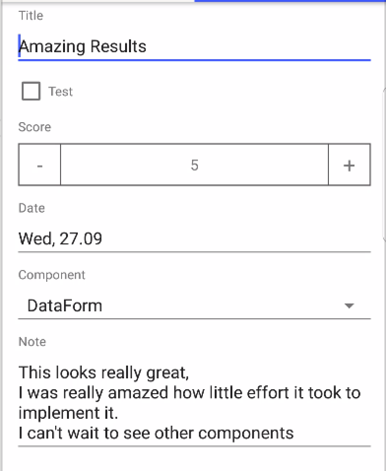
Let’s say we want to create a feedback form with the following structure.
Please note that for component we will use the components array as a source of values.
  public feedback = {
    title: 'Amazing Results',
    score: 5,
    date: new Date(),
    component: 'DataForm',
    note: `This looks really great,
I was really amazed how little effort it took to implement it.
I can't wait to see other components`,
    test: false
  }

  public components: string[] = [
    'DataForm',
    'SideDrawer',
    'Calendar',
    'ListView',
    'Gauge',
    'AutoComplete'
  ];
To do that we need to use RadDataForm.
First we need to add it to the @NgModule:
import { NativeScriptUIDataFormModule } from 'nativescript-ui-dataform/angular';
...

@NgModule({
  imports: [
    NativeScriptUIDataFormModule,
    ...
  ],
  ...
})
Then we can add the RadDataForm (with source bound to feedback) to the html:
<RadDataForm [source]="feedback">
</RadDataForm>
This will already produce a nice DataForm, however the form doesn’t necessarily know in which order to arrange the fields or what sort of input editors we want to use.
Configuring Properties
For a simple field we need to use TKEntityProperty. We need to provide
name- the name of the property,displayName- the label for the field,index- used to define the order in which the fields should be displayed on the form, 1 means first
<RadDataForm [source]="feedback">
  <TKEntityProperty tkDataFormProperty name="name" displayName="displayName" index="1"></TKEntityProperty>
</RadDataForm>
Configuring Editors
Then we can additionally specify an editor type. For the full list see the documentation
For example, to match to a date we can use TKPropertyEditor with type:"DatePicker":
<RadDataForm [source]="feedback">
  <TKEntityProperty tkDataFormProperty name="date" displayName="Date" index="3">
    <TKPropertyEditor tkEntityPropertyEditor type="DatePicker"></TKPropertyEditor>
  </TKEntityProperty>
</RadDataForm>
Configuring List based Editors
Also to provide a list of possible values we can use TKPropertyEditor with type:"DatePicker" and [valuesProvider]:
<RadDataForm [source]="feedback">
  <TKEntityProperty tkDataFormProperty name="component" displayName="Component" index="4" [valuesProvider]="components">
    <TKPropertyEditor tkEntityPropertyEditor type="Picker"></TKPropertyEditor>
  </TKEntityProperty>
</RadDataForm>
Final result
Here is the full implementation of the feedback form:
<RadDataForm [source]="feedback">
  <TKEntityProperty tkDataFormProperty name="name" displayName="displayName" index="1"></TKEntityProperty>
  <TKEntityProperty tkDataFormProperty name="score" displayName="Score" index="2">
    <TKPropertyEditor tkEntityPropertyEditor type="Stepper"></TKPropertyEditor>
  </TKEntityProperty>
  <TKEntityProperty tkDataFormProperty name="date" displayName="Date" index="3">
    <TKPropertyEditor tkEntityPropertyEditor type="DatePicker"></TKPropertyEditor>
  </TKEntityProperty>
  <TKEntityProperty tkDataFormProperty name="component" displayName="Component" index="4" [valuesProvider]="components">
    <TKPropertyEditor tkEntityPropertyEditor type="Picker"></TKPropertyEditor>
  </TKEntityProperty>
  <TKEntityProperty tkDataFormProperty name="note" displayName="Note" index="5">
    <TKPropertyEditor tkEntityPropertyEditor type="MultilineText"></TKPropertyEditor>
  </TKEntityProperty>
</RadDataForm>
This is just scratching the surface of what RadDataForm can do. We can also add input validation, add field grouping add images and more.
Exercise: NativeScript UI
Exercise: NativeScript UI
Change selectedIndex="1" on the TabView component, so that each time the app refreshes we will start on the second tab.
In this exercise you need to populate Entity Properties to match each item of the profile.
There is already a RadDataForm on the second tab.
<RadDataForm [source]="profile" row="0">

</RadDataForm>
You can find the list of editors in the documentation
Here is how your DataForm should look like:
<RadDataForm [source]="profile" row="0">
  <TKEntityProperty tkDataFormProperty name="name" displayName="Name" index="0"></TKEntityProperty>
  <TKEntityProperty tkDataFormProperty name="password" displayName="Password" index="1">
    <TKPropertyEditor tkEntityPropertyEditor type="Password"></TKPropertyEditor>
  </TKEntityProperty>
  <TKEntityProperty tkDataFormProperty name="dob" displayName="DOB" index="2">
    <TKPropertyEditor tkEntityPropertyEditor type="DatePicker"></TKPropertyEditor>
  </TKEntityProperty>
  <TKEntityProperty tkDataFormProperty name="codingPower" displayName="Coding Power" index="3">
    <TKPropertyEditor tkEntityPropertyEditor type="Stepper"></TKPropertyEditor>
  </TKEntityProperty>
  <TKEntityProperty tkDataFormProperty name="angularPro" displayName="Angular Pro" index="3">
    <TKPropertyEditor tkEntityPropertyEditor type="Switch"></TKPropertyEditor>
  </TKEntityProperty>
</RadDataForm>
Lesson 2 - Navigation
Intro
In this lesson we are going to familiarize ourselves with navigation techniques.
Routing configuration
The Angular Router enables navigation from one view to the next as users perform application tasks.
A routed Angular application has one singleton instance of the Router service. When the app’s URL changes, that router looks for a corresponding Route from which it can determine the component to display.
When you create a brand new {N} app, you will straight away get a sample Routes configuration, which should look like this:
const routes: Routes = [
  { path: '', redirectTo: '/items', pathMatch: 'full' },
  { path: 'items', component: ItemsComponent },
  { path: 'item/:id', component: ItemDetailComponent },
];
This tells us 3 things:
- When the app starts, it should automatically redirect to
itemspath, - If you navigate to
'items', you will be provided withItemsComponent, - If you navigate to
'items/somevalue'you will be provided withItemDetailComponent, which additionally will receivesomevalueasid
As your application grows, so will your list of routes. One way to manage them is to group them into related parent<->children groups like this:
const routes: Routes = [
  { path: '', redirectTo: '/articles', pathMatch: 'full' },
  { path: 'items', children: [
    { path: '', component: ItemsComponent },
    { path: ':id', component: ItemDetailComponent },
  ]},
  { path: 'articles', children: [
    { path: '', component: ArticlesComponent },
    { path: 'read/:id', component: ArticleComponent },
    { path: 'edit/:id', component: EditArticleComponent },
    { path: 'search/:tech/:keyword', component: ArticleSearchResultsComponent },
  ]},
];
This time:
- The default path is for
articles, itemsanditems/:idare grouped together, which means that we could changeitemsto something else in just one place,- We can also navigate to
articles,articles/read/5,articles/edit/5andarticles/search/angular/navigation(this will translate totech='angular'andkeyword='navigation')
There is a lot more you can do in here, which is out of scope for this workshop. See Angular docs for more info on the subject.
Exercise: Routing configuration
Exercise: Routing configuration
Step 1
For this exercise we will use the contents of the app/color folder, which already contains some pieces of the app that we need.
Open app.routing.ts and change the redirectTo of the default route to '/color'
{ path: '', redirectTo: '/color', pathMatch: 'full' },
If you are using Playground then you should head to: https://play.nativescript.org/?template=nsday-color`
Step 2
Now it is time to add routes for the Red and RGB components. Update the children of the color route, so that:
'color/red'path will navigate toRedComponent- you can see how this is done for theblueexample,'color/rgb'+rgb(as a parameter) path will navigate toRGBComponentwhile passing thergbparameter
{ path: 'color', children: [
  { path: '', component: ColorComponent },
  { path: 'blue', component: BlueComponent },
  { path: 'red', component: RedComponent },
  { path: 'rgb/:rgb', component: RGBComponent },
]},
Navigation from template
One way to add navigation in markup is with the nsRouterLink directive. It is similar to routerLink (which is used in the web), but works with NativeScript navigation.
nsRouterLink expects an array of parameters, which can be matched to one of the routes defined in app.routes.ts.
For example, if we want to create a label that should navigate to a “reading” page and pass it a value, such as “5”, we can achieve this by providing an absolute path. That would look something like this:
<Label text="Angular Navigation" [nsRouterLink]="['/articles/read', '5']"></Label>
Relative Paths
We can also use relative paths. Where you provide the path based on the page you are currently at.
Children
If you are in the articles page (path '/articles') and want to navigate to the same pages as in the previous example. You can use './name_of_child_path' or 'name_of_child_path', like this:
<!--With an embeded param-->
<Label text="Angular Navigation" [nsRouterLink]="['./read', '5']"></Label>
<!--with a param provided separately-->
<Label text="Angular Navigation" [nsRouterLink]="['./read', navigationId]"></Label>
OR
<Label text="Angular Navigation" [nsRouterLink]="['read', '5']"></Label>
<Label text="Angular Navigation" [nsRouterLink]="['read', navigationId]"></Label>
Parent
If you are in the 'articles/read/5' route and you want to provide a relative path back to the parent, you can use '..', like this:
<Label text="Articles" [nsRouterLink]="['..']"></Label>
Siblings
If you are in the 'articles/read/5' route and you want to provide a relative path to the edit page or search page, you can use '../name_of_sibling_path', like this:
<Label text="Articles" [nsRouterLink]="['../edit', 5]"></Label>
<Label text="Articles" [nsRouterLink]="['../search', 'angular', 'navigation']"></Label>
Cheat sheet
[nsRouterLink]="['/absolute']"
<!--Navigate to parent-->
[nsRouterLink]="['..']"

[nsRouterLink]="['../sibling']"

[nsRouterLink]="['./child']" // or
[nsRouterLink]="['child']"
Clear History
Also if you add a clearHistory flag, you can clear the navigation stack. Which means that there won’t be a back button displayed on iOS, or pressing back on Android will not take you back to this page again.
<Label text="Back to Articles" [nsRouterLink]="['..']" clearHistory="true"></Label>
Exercise: Navigation with nsRouterLink
Exercise: Navigation with nsRouterLink
Open color.component.html and update [nsRouterLink] for each button, so that:
Bluebutton navigates to theBlueComponentRedbutton navigates to theRedComponentPinkbutton navigates to theRGBComponentwith'#ff0088'as the parameterGraybutton navigates to theRGBComponentwith'gray'as the parameterLavenderbutton navigates to theRGBComponentwith'#bad'as the parameter
NOTE: The parameter you pass to the “rgb” route won’t have an effect on that page—yet. Later in this section you’ll utilize that data to change the colors on the “rgb” component.
Here is the configuration for each:
Blue
[nsRouterLink]="['/color/blue']" OR [nsRouterLink]="['blue']"
Red
[nsRouterLink]="['/color/red']" OR [nsRouterLink]="['red']"
Pink
[nsRouterLink]="['/color/rgb', '#ff0088']" OR [nsRouterLink]="['rgb', '#ff0088']"
Gray
[nsRouterLink]="['/color/rgb', 'gray']" OR [nsRouterLink]="['rgb', 'gray']"
Lavender
[nsRouterLink]="['/color/rgb', '#bad']" OR [nsRouterLink]="['rgb', '#bad']"
Navigation with code
Navigation can also be done with JavaScript.
For that you will either need the standard Router from @angular/router, or RouterExtensions from nativescript-angular/router, which comes with additional functionality: to clearHistory, choose a page transition or navigate back.
Note: If you are working on a project where you need to share the code between web and mobile, then you might want to use the standard Angular
Router. However if your project is mobile only, then you should stick withRouterExtensions.
Navigation: how to
Once you choose which Router to use, navigation is really easy:
- import the router you need,
- inject the router in the constructor,
- call navigate - just like you did with nsRouterLink
import { Router } from '@angular/router';
// or
import { RouterExtensions } from 'nativescript-angular';

@Component({
  selector: 'my-articles',
  templateUrl: './articles/articles.component.html',
})
export class ArticlesComponent {
  constructor(private router: RouterExtensions) {
  }

  readArticle(id: number) {
    this.router.navigate(['/articles/read', id]);
  }
}
Relative path
To use a relative path you need to:
- import
ActivatedRoute, which can be used as therelative point, - inject it in the constructor
- provide it as a parameter for
navigate, asrelativeTo
import { RouterExtensions } from 'nativescript-angular';
import { ActivatedRoute } from '@angular/router';

@Component({
  selector: 'my-articles',
  templateUrl: './articles/articles.component.html',
})
export class ArticlesComponent {
  constructor(
    private router: RouterExtensions,
    private route: ActivatedRoute) {
  }

  readArticle(id: number) {
    this.router.navigate(['./read', id], { relativeTo: this.route });
  }
}
Cheat sheet
this.router.navigate(['/absolute/path']);
//navigate to parent
this.router.navigate(['..'],         {relativeTo: this.route});

this.router.navigate(['../sibling'], {relativeTo: this.route});

this.router.navigate(['./child'],    {relativeTo: this.route}); // or
this.router.navigate(['child'],      {relativeTo: this.route});
Clear History
To clear history just provide clearHistory into navigate, like this:
this.router.navigate(['/articles'], { clearHistory: true } );
Please note that you must use RouterExtensions for this to work. Also, clearHistory works only with page-router-outlet; this doesn’t work with router-outlet.
Navigating back
To navigate back, you can use RouterExtensions functionality to call either:
this.router.back()- always takes us to back the previous view from the navigation stack,this.router.backToPreviousPage()- always takes us back to the previous page from the navigation stack, skipping navigation stack items on the same page.
What is the difference?
Let’s imagine you navigated through a number of paths in this order.
- navigate
/articles - navigate
/articles/read/1 - navigate
/articles/read/2 - navigate
/articles/edit/3
So now we are at /articles/edit/3.
Calling back or backToPreviousPage, will both result in navigating to:
/articles/read/2.
Now calling back would take us to /articles/read/1, which is another article in the same page.
However calling backToPreviousPage from /articles/read/2, would take us to /articles.
Default iOS and Android back operations
The default back button which appears in the iOS <ActionBar> performs backToPreviousPage, while the Android back button performs back.
Exercise: Navigation with code
Exercise: Navigation with code
In this exercise we will play with the blue component. The blue.component.html already contains four buttons, each calling a different function.
Your task is to implement the empty functions in blue.component.ts, so that:
- goRed() navigates to the
Redpage - goPink() navigates to the
RGBpage withthis.pinkas the parameter - goBack() navigates back
- goHome() navigates home whilst clearing the navigation history
goRed (Absolute Solution)
this.router.navigate(['/color/red']);
goPink
this.router.navigate(['/color/rgb', this.pink]);
goBack
this.router.back();
goHome
this.router.navigate(['/color'], { clearHistory: true });
Receiving parameters
For components that are expected to receive parameters from the route navigation, you need to use ActivatedRoute.
You just have to perform the appropriate imports:
Import
import { ActivatedRoute } from '@angular/router';
Inject
export class ArticleSearchResultsComponent {
  constructor(private route: ActivatedRoute) {
  }
}
Use
Here we have two options. You can take a snapshot, which will be triggered only when we navigate to this page from another page.
ngOnInit() {
  this.tech = this.route.snapshot.params['tech'];
  this.keyword = this.route.snapshot.params['keyword'];

  this.searchArticles(this.tech, this.keyword);
}
Navigate to self
Using a snapshot will not work if we try to navigate from the search to itself, but with different parameters. To make this work, we need to use params.forEach instead.
ngOnInit() {
  this.route.params
    .forEach(params => {
      this.tech = this.route.snapshot.params['tech'];
      this.keyword = this.route.snapshot.params['keyword'];

      this.searchArticles(this.tech, this.keyword);
    });
}
Exercise: Receiving parameters
Exercise: Receiving parameters
In this exercise we will play with the rgb component: rgb.component.ts. Currently every time you navigate to rgb the input parameters are getting ignored. Your task is to intercept the ‘rgb’ parameter and update this.rgb.
ngOnInit() {
  this.route.params
    .forEach(params => this.rgb = params['rgb']);
}
Page Transitions
One of the great things about NativeScript is its ability to use native animations and page transitions with very little effort.
Here is a list of all available navigation transitions
Here is a list of all available animation curves
Transition via html
To add pageTransition in html, just add pageTransition with a name of the transition you need:
<Button
  text="Open Path"
  [nsRouterLink]="['/path']"
  pageTransition="slideBottom">
</Button>
Transition via code
To add page transition in JavaScript, just add a transition object to the navigate options. Just like this:
this.router.navigate(['/relative/path'], {
  transition: {
    name: 'slideBottom',
    duration: 500,
    curve: 'linear'
  }
});
Exercise: Page Transitions
Exercise: Page Transitions
In this exercise we will play with the color and red components.
Step 1
Your task is to update the buttons in color.component.html, so that:
- The
Bluebutton triggerscurltransition - The
Redbutton triggers thefadetransition - The
Pink,Grayand#badbuttons trigger thefliptransition
Blue=>pageTransition="curl"Red=>pageTransition="fade"Pink,Grayand#bad=>pageTransition="flip"
Step 2
red.component.html already contains 4 buttons, each calling a different function.
Your task is to implement the empty functions in red.component.ts, so that:
- goBlue() navigates to the
Bluepage with page transitionslideTop, duration2 secondsand curvespring - goGray() navigates to the
RGBpage withgrayas the parameter and page transitionfadeand duration1 second
goBlue
this.router.navigate(['/color/blue'], {
  transition: {
    name: 'slideTop',
    duration: 2000,
    curve: 'spring'
  }
});
goGray
this.router.navigate(['/color/rgb', 'gray'], {
  transition: {
    name: 'fade',
    duration: 1000
  }
});
Lesson 3 - Components and Services
Services
Services are JavaScript functions that are responsible for doing a specific task. Angular services are injected using a Dependency Injection mechanism and include the value, function or feature that is required by the application. There is nothing especially related to Services in NativeScript Angular–there is no ServiceBase class–but still services can be treated as fundamental to Angular applications.
Creating a service
Creating a Service is really simple. You need to import Injectable function and apply it as the @Injectable decorator. Then we need to create a class for our service and export it:
import { Injectable } from '@angular/core';

@Injectable()
export class MyHappyService {

  public doSomethingFun() {
    console.log('I am a happy bunny... hop, hop, hop');
  }
}
Naming convention
Following the naming convention in Angular, the above service should be placed in a file called: my-happy.service.ts. This is basically the name of the class in lower case, each word (excluding the word service) separated with - and followed by .service.ts.
The same naming convention applies to all files in an Angular app like: currency.pipe.ts, navigation-menu.component.ts, login.model.ts.
Adding the service to app.modules.ts
In order to make our service available in the app, you need to add to providers in the @NgModule.
The global @NgModule is located in app.module.ts.
import { MyHappyService } from './my-happy.service';

@NgModule({
  bootstrap: [
    AppComponent
  ],
  imports: [
    NativeScriptModule,
    AppRoutingModule,
    NativeScriptHttpClientModule,
    NativeScriptFormsModule
  ],
  declarations: [
    AppComponent,
    ProfileComponent
  ],
  providers: [
    MyHappyService
  ],
  schemas: [
    NO_ERRORS_SCHEMA
  ]
})
export class AppModule { }
providedIn
You can also use providedIn property in the @Injectable decorator, which delegates it to Angular to provide the service in 'root' or a specific module.
@Injectable({
  providedIn: 'root'
})
export class MyHappyService {

  public doSomethingFun() {
    console.log('I am a happy bunny... hop, hop, hop');
  }
}
This way you don’t have to add it manually to the providers list of your ngModule.
Injecting services
In order to use a service in a component, we need to inject it in the component’s constructor.
Note: You can also inject services into other services or pipes.
This is done like this:
constructor(private myHappyService: MyHappyService) {
  //constructor code
}
Here is how you inject and then use a service:
import { MyHappyService } from '../my-happy.service';

@Component({
  selector: 'app-mood',
  templateUrl: './mood/mood.component.html'
})
export class MoodComponent {

  constructor(private myHappyService: MyHappyService) {
  }

  showYourMood() {
    this.myHappyService.doSomethingFun();
  }
}
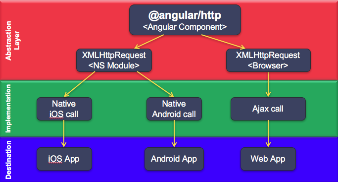
HttpClient
NativeScript comes with its own implementation of the HttpClientModule, which uses Android and iOS native functionality to perform the calls.
This is exposed as NativeScriptHttpClientModule, which implements the same interface as the web HttpClient module.
HttpClient: adding the module to the app
This means that all you have to do is declare our NativeScript wrapper in the respective module file and Dependency Injection will take care of the rest.
This is done by adding NativeScriptHttpClientModule to @NgModule imports.
import { NativeScriptHttpClientModule } from 'nativescript-angular/http-client';
imports: [
  ...
  NativeScriptHttpClientModule,
],
From this point onwards the code that uses the HttpClient module is exactly the same as the code you would write for a web application.
This gives us a high level Angular HttpClient module that is capable of performing various request natively for Android, iOS and Web.
HttpClient: Injecting the service
Then you can import and Inject the Http module where you are planning to use it.
import { HttpClient } from '@angular/common/http';
constructor(private http: HttpClient) {
}
HttpClient: calling the service
The http module has a bunch of useful functions like, get, post, put, delete and others. <td/>
Each takes a url as a parameter and optional options, and then they return an Observable with a Response.
get<ResultType>(url: string, options?: RequestOptionsArgs): Observable<Response>
Example of how to call get and subscribe to the Observable result: <td/>
Please note that you should always convert the response to json()
doSomething() {
  this.http.get<City[]>('http://api.someopendata.org/cities') // make the call
  .subscribe(                                                 // subscribe and do something with the result
    result => console.log(result.cities),
    error => console.error('Error: ' + error),
    () => console.log('Completed!')
  )
}
Example of how to call get and convert the Observable to a Promise:
doSomething() {
  this.http.get<City[]>('http://api.someopendata.org/cities') // make the call
  .toPromise()                                                // convert the observable to a promise
  .then(                                                      // then do something with the result
    result => console.log(result.cities),
    error => console.error('Error: ' + error)
  )
}
HttpClient: Adding Headers to http calls
If you need to pass headers into a http call, you can construct it by using Headers class, append data and then add it to options?: RequestOptionsArgs.
import { HttpClient, HttpHeaders } from '@angular/common/http';
let myHeaders = new HttpHeaders();
myHeaders.append('key', 'value');

this.http.get<City[]>('http://api.someopendata.org/cities',
  { headers: myHeaders })
HttpClient: Constructing URL search params
If you need to pass query parameters (like service?mood=’happy’&face=’round’) into a http call, you can construct it by using HttpParams class, append query params and then add it to options?: RequestOptionsArgs.
import { Http, HttpHeaders, HttpParams } from '@angular/common/http';
let searchParams = new HttpParams();
searchParams = searchParams.set('mood', 'happy');
searchParams = searchParams.set('face', 'round');

this.http.get<any>('http://api.someopendata.org/cities',
  { headers: myHeaders, params: searchParams })
Http parsing results
Very often the response returned from the http service doesn’t come in the format that we might need.
For example calling:
const cities$: Observable<any> = this.http.get<any>('http://api.someopendata.org/cities');
Might return an object like:
{
  responseCode: 200,
  data: [
    'London', 'Paris', 'Amsterdam', 'Warsaw', 'Sofia'
  ]
}
While, you might be interested in the output to be formatted as an array of cities. <td/>
To do that you can use pipe with a map from rxjs, like this:
const cities$: Observable<string[]> = this.http.get<any>('http://api.someopendata.org/cities')
  .pipe(
    map(res => res.data)
  );
In the case where the response comes as a more complex object, like this:
{
  responseCode: 200,
  complexData: [
    { city: 'London', country: 'England' },
    { city: 'Paris', country: 'France' },
    { city: 'Amsterdam', country: 'Netherlands' },
    { city: 'Warsaw', country: 'Poland' },
    { city: 'Sofia', country: 'Bulgaria' },
  ]
}
You could achieve the same in two steps:
- First map
complexDataproperty (like before) - Second - use
.map()on thedataobject, and extractitem.city(note you can name thedataanditemparams as anything you want)
Like this:
const cities$: Observable<string[]> = this.http.get<any>('http://api.someopendata.org/cities')
  .pipe(
    map(res => res.complexData),
    map(data => data.map(item => item.city) )
  );
Or in one line:
const cities$: Observable<any> = this.http.get<any>('http://api.someopendata.org/cities')
  .pipe(
    map(res => res.complexData.map(item => item.city) ),
  );
Then you could easily call:
cities$.subscribe(cities => {
  console.log(cities); // this will print out an array of strings
})
Subscribe / Unsubscribe
Calling .subscribe() on an Observable is one of the way to get data out of it.
Some of the Observables, like the one from http.get() automatically close and clean up, as soon as you receive the result.
While other Observables remain active, until you call .unsubscribe(). Like this:
const myItems$: Observable<any> = this.listenToItems();

const subscription: Subscription = myItems$.subscribe(
  items => // do something with items;
)

subscription.unsubscribe();
A good place to subscribe() is in ngOnInit().
A good place to unsubscribe() is in ngOnDestroy().
Note, there is no need to call
.unsubscribe()on Observables returned from theHttpClient.
Async pipe
Angular has a very clean way of extracting data out of an Observable. It is called async pipe. It automatically subscribes to the provided Observable object, and unsubscribes when the component is getting cleaned up.
With the help of the async pipe you may never need to explicitly call subscribe ever again.
Here is how it works.
- In the component definition, you get an Observable, and assign it to a property:
@Component({
  ...
})
export class MyComponent implements OnInit {
  public cities$: Observable<City[]>;

  constructor(public http: HttpClient) {}

  ngOnInit() {
    this.cities$ = this.http.get('http://api.someopendata.org/cities')
      .pipe(
        map(res => res.data)
      );
  }
}
- Then from the component template, you assign your the UI component to the Observable object and
| asyncnext to it, like this:
<ListView [items]="cities$ | async" class="list-group">
  <ng-template let-city="item">
    <StackLayout>
      <Label [text]="city" class="list-group-item"></Label>
    </StackLayout>
  </ng-template>
</ListView>
In the above example, the listview will be populated with the data returned from the cities$ observable.
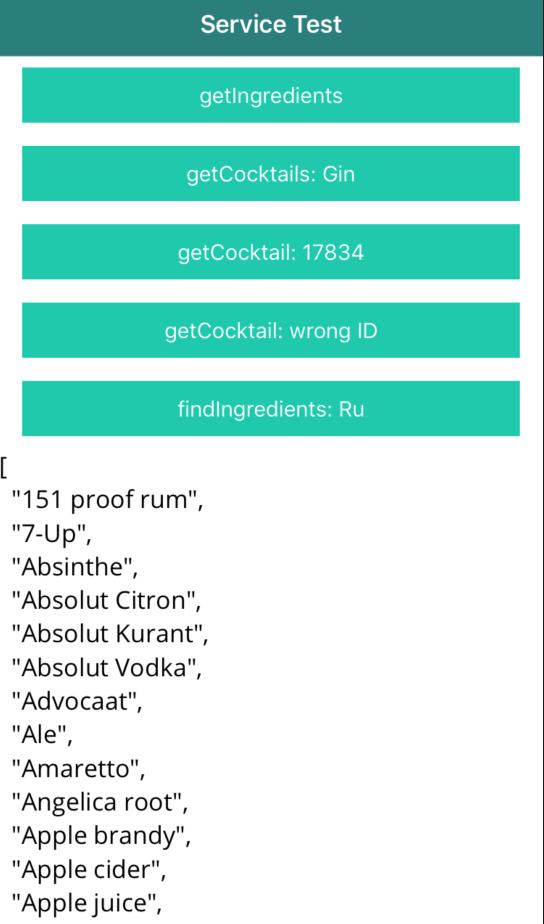
Exercise: Cocktail Service
For this exercise we will use ServiceTestComponent located in service-test folder and CocktailService, which you can find in cocktail.service.ts.
ServiceTestComponent has several buttons, each designed to test a function of the CocktailService that you will be constructing in this exercise.
The football service is based on thecocktaildb.com API
Exercise: Change default the default route to show the Service Test Component
Let’s start with changing the default route in app.routing.ts to '/service-test':
{ path: '', redirectTo: '/service-test', pathMatch: 'full' },
This should load an app with a bunch of buttons. At this moment pressing each button should result in an error message.
Exercise: Implementing the http calls
Step 1 - Make it work
When you open cocktail.service.ts you will see that there are already a few function in there, however they are not implemented yet.
Step 2 - Implement the missing functions
Your job is to implement these functions:
getIngredients()- make a get call to:
https://www.thecocktaildb.com/api/json/v1/1/list.php?i=list - you can call get with
IngredientsRawResultas the expected result type, like thisget<IngredientsRawResult>() - make sure to
pipe->mapthe output to return an array of strings, containing ingredient names.
- make a get call to:
getCocktails(ingredient: string)- make a call to:
https://www.thecocktaildb.com/api/json/v1/1/filter.php?i=Ginwith theingredientas theiparameter. - before you call
get(), you need to constructHttpParamswithingredientpassed asi - you can call
get()withCocktailsRawResultas the expected result type - make sure to
pipe->mapthe output to return the drinks array. (Optional) you may want to return an empty array if the output is null
- make a call to:
getCocktail(id: string)- should make a call to:
https://www.thecocktaildb.com/api/json/v1/1/lookup.php?i=13940with theidas theiparameter - before you call
get(), you need to constructHttpParamswithidpassed asi - you can call
get()withCocktailRawResultas the expected result type - make sure to
pipe->mapthe output, to return aCocktailRecipeobject ( you can use theCocktailRecipe constructoron the first item returned in the result]
- should make a call to:
In each function you will need to follow these steps:
- construct the
url- you can use thebaseUrlproperty as the basis - construct
HttpParamsif required - use the
httpservice to callget<ResultType>(url, { params: myParams }) - use
pipeandmapto parse the result into the correct format
As you implement each of the functions, you can test them with the buttons in the Service Test. If you get the data in the terminal, then you most likely did it right. But if you get an error message, then you need to keep working :)
getIngredients
public getIngredients(): Observable<string[]> {
  const url = `${this.baseUrl}/list.php?i=list`;

  return this.http.get<IngredientsRawResult>(url)
    .pipe(
      map(result => result.drinks.map(ingredient => ingredient.strIngredient1)),
      map(ingredients => ingredients.sort())
    );
}
getCocktails
public getCocktails(ingredient: string): Observable<CocktailOverviewRaw[]> {
  const url = `${this.baseUrl}/filter.php`;
  const params = new HttpParams().set('i', ingredient);

  return this.http.get<CocktailsRawResult>(url, { params })
    .pipe(
      map(result => (result) ? result.drinks : [])
    );
}
getCocktail
public getCocktail(id: string): Observable<CocktailRecipe> {
  const url = `${this.baseUrl}/lookup.php`;
  const params = new HttpParams().set('i', id);

  return this.http.get<CocktailRawResult>(url, { params })
    .pipe(
      map(result =>
        new CocktailRecipe(result.drinks[0])
      )
    );
}
Components
The component is a controller class with a template which mainly deals with a view of the application and logic on the page. It is a bit of code that can be used throughout an application. The component knows how to render itself and configure dependency injection.
The component contains two important things; one is a view and another contains some logic.
A component is usually made of a @Component decorator, which contains:
selector- html tag that should be used for this componenttemplateUrl- a location of the file that contains the html code (view) - you can also usetemplateto provide the html code inline, but this is not a great ideastyleUrls- a location of the file that contains the css
Then we need a Component Class that will encapsulate all the logic.
Here is an example:
blue.component.ts
@Component({
  selector: 'my-blue',
  templateUrl: './color/blue.component.html',
  styleUrls: ['./color/color.component.css']
})
export class BlueComponent{
  private pink: string = '#ff0088';

  constructor(private router: RouterExtensions, private route: ActivatedRoute) {
  }

  // other functions
}
blue.component.html
<ActionBar title="BLUE" color="white" backgroundColor="blue">
</ActionBar>

<StackLayout>
  <Button text="Go Red" (tap)="goRed()" class="btn red"></Button>
  <Button text="Go Pink" (tap)="goPink()" class="btn pink"></Button>
  <Button text="Go Home" (tap)="goHome()" class="btn btn-primary"></Button>
  <Button text="Go Back" (tap)="goBack()" class="btn btn-outline"></Button>
</StackLayout>
Adding your component to the app
If you try to use your module straight after creating it, you will get an error like this: Component BlueComponent is not part of any NgModule or the module has not been imported into your module.
Solution:
All components should be added to @NgModule declarations. By default each should be added to app.modules.ts:
declarations: [
  AppComponent,
  ProfileComponent,
  ColorComponent,
  BlueComponent,
  RedComponent,
  RGBComponent,
]
Smart versus Presentation components
Components can be divided into two categories:
- smart - those contain the business logic of your application. Like a
LoginComponentthat contains the logic of how to log in and where to redirect after user successfully logs in - presentation - those are used to encapsulate something that we want to show on the screen. Like a
LogoComponent, which contains theimgtag with your logo, which you can paste everywhere you need to display your logo. However when you need to change the logo, you can do it all in one place (the definition of the component).
Components with custom input (one-way binding)
Just like the <Label> component has a text attribute, your components can have their own custom attributes as well.
Adding custom attributes to a component is really easy—just add an @Input() decorator in front of your attribute or property set and you are ready to go.
@Component({
  selector: 'my-calendar',
  templateUrl: './calendar/calendar.component.html'
})
export class CalendarComponent {
  @Input() day: number;
  @Input() month: number;

  private _year: number;
  @Input() set year(year: number) {
    this._year = (year > 100) ? year : year + 2000;
  }
Now you can use it like this:
<my-calendar day="12" month="11" year="10"></my-calendar>
Exercise: Creating a presentation component with @Input
For this part of the exercise we will be using all components in the cocktail folder.
Change the default route to:
{ path: '', redirectTo: '/drinks', pathMatch: 'full' },
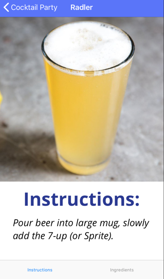
And run the application. You should get a view displaying a list of ingredients, and if you tap on one you should be presented with a list of cocktails. When you tap on a cocktail the app should navigate to the details page.
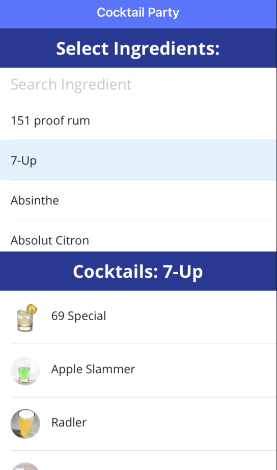
Your task is to implement a Presentation Component called CocktailItemComponent, which can be used to display each item in the Cocktails List View, instead of the current XML teplate
Exercise: Create CocktailItemComponent with @Input
Step 1 - Replace current Drinks ListView template
The initial structure for CocktailItemComponent is already in place (see cocktail-item.component.ts) and added to declarations in app.module.ts.
Open cocktails.component.html, comment out the GridLayout that is inside the second ListView and then add the below code in its place:
<cocktail-item
  [data]="cocktail">
</cocktail-item>
You will notice that cocktail-item expects a [data] attribute (which is used to pass over the cocktail object).
Also cocktail-item contains [nsRouterLink], as the navigation configuration should be managed from the Parent component (CocktailsComponent), not the Presentation component.
Step 2 - Update the template in the CocktailItem Component
Now, copy over the commented out <GridLayout> template to cocktail-item.component.html. But remember to remove the [nsRouterLink] property. Then change each cocktail. to data.
Your cocktail-item.component.html should look like this:
<GridLayout class="list-group-item" rows="auto" columns="auto, *"
  [nsRouterLink]="['./recipe', data.idDrink]">
  <Image [src]="data.strDrinkThumb" width="40" class="thumb img-circle"></Image>
  <Label col="1" [text]="data.strDrink" class="list-group-item-heading font-sb"></Label>
</GridLayout>
Step 3 - Enable the CocktailItem Component to receive cocktails as a data attribute
Finally, in order for the cocktail-item to be able to receive data, you need to add an @Input() data: CocktailOverviewRaw to the Component definition in cocktail-item.component.ts.
Your component should look like this:
export class CocktailItemComponent {
  @Input() data: CocktailOverviewRaw;

  constructor() { }
}
Now if you reload the app and select an ingredient, the app should work as before, but this time you have nice separation of how the Drinks ListView should present each item.
Components with custom events
Adding a custom event - like a (tap) event - to a component is easy.
This is done by adding an EventEmitter property with an @Output decorator.
Like this:
@Component({
  selector: 'team-selector'
  ...
})
export class TeamSelectorComponent {
  @Output() teamSelected: EventEmitter<number> = new EventEmitter<number>();
}
This automatically means that our component, will have an event called (teamSelected), which should be emitting numbers. And can be used like this (note that $event will pass the numbers emitted by the event).
<team-selector (teamSelected)="doSomething($event)"></team-selector>
Emitting values
To make your component emit values, you just call .emit(value) on your event emitter. Like this (see onTeamChanged()):
@Component({
  selector: 'team-selector'
  ...
})
export class TeamSelectorComponent {
  @Output() teamSelected: EventEmitter<number> = new EventEmitter<number>();

  onTeamChanged(teamId) {
    this.teamSelected.emit(teamId);
  }
}
This way, every time the TeamSelectorComponent calls onTeamChanged, this will result in the emitter triggering the (teamSelected) event.
In the case of the below example, this will result in calling doSomething() with the $event value equal to teamId.
<team-selector (teamSelected)="doSomething($event)"></team-selector>
Components with custom input (two-way binding)
To create a custom attribute that is capable of both taking data as an input and also updating it, we need to use two-way binding.
To do that we need to combine the power of the @Input and @Output decorators.
Let’s imagine we are working on a ColorPicker component, which should take a color, as an input, but when the user selects a different color, it should provide an updated value.
First we need to create a property @Input color.
Then we need to add a custom event, which is called propertyNameChange. For our example we’ll use @Output() colorChange.
Finally, we need to emit the new value colorChange.emit(newColor);
Here is the full code:
@Component({
  selector: 'color-picker',
  templateUrl: './color-picker/color-picker.component.html'
})
export class ColorPickerComponent {
  @Input color: string;
  @Output() colorChange = new EventEmitter<string>();

  onColorPick(newColor: string) {
    colorChange.emit(newColor);
  }
}
Please note that @Input could be also used with a getter and setter.
Now you can use the ColorPickerComponent like this:
<color-picker [(color)]="selectedColorFromParentClass"></color-picker>
Exercise: Creating a presentation component with @Input @Output
In this exercise we need to update the CocktailsComponent to replace the first StackLayout that is used for finding an ingredient, and instead use the SearchComponent, like this:
<search-ingredient row="0"
    [(ingredient)]="selectedIngredient"
    (ingredientChange)="updateCocktailList($event)">
</search-ingredient>
The SearchComponent already contains most of the logic required to load a list of ingredients, and filter them as the user types in the TextField.
Your task is to update the SearchComponent, so that it allows:
- two way binding to
[(ingredient)], - emitting selected ingredient via
(ingredientChange)
Hint: Both of these task can be accomplished by adding
@Input()and@Output()tosearch.component.ts. Make sure to alsoemit()ingredients via the emitter.
Exercise: Update LeagueTableComponent with @Output
Step 0 - Switch to use SearchComponent
You can start by commenting out the code in cocktails.component.html that is between:
<!-- Ingredient Search <start> -->
   code
<!-- Ingredient Search <end> -->
Uncomment the <search-ingredient> code, to use the SearchComponent instead.
Then also comment out the code in cocktails.component.ts that is between:
/* Ingredient Search <start> */
   code
/* Ingredient Search <end> */
Step 1 - Add @Input() to ingredient
Add @Input() decorator to the ingredient property to the SearchComponent in search.component.ts.
@Input() ingredient: string;
Step 2 - Add @Output EventEmitter
Add an EventEmitter<string> called ingredientChange.
This will work as (ingredientChange) event, but also it will enable two-way binding on the ingredient property.
@Output() ingredientChange = new EventEmitter<string>();
Step 3 - Emit value
Update the selectIngredient function, so that it emits the ingredientChange event with the val.
public selectIngredient(val: string) {
  this.ingredientChange.emit(val);
}
Step 3 - Call selectIngredient from the UI
Now we need the selected Label in the ListView in search.component.html to call selectIngredient whenever the user taps on one of the ingredients.
Add (tap)="selectIngredient(item)" to the Label inside the ListView.
<Label
  [text]="item"
  class="list-group-item" [class.selected]="ingredient === item"
  (tap)="selectIngredient(item)">
</Label>
Step 4
Test the app to see if this works.
Now upon tapping on a team in the table you should be redirected to a team view, which should display fixtures for that given team.
Lesson 4 - Plugins
In this Lesson you are going to learn how to use a few out of a generous collection of NativeScript plugins.
Most of the plugins you can install either by calling npm install or for those that contain some native iOS and/or Android elements tns plugin add.
Exercise: Setup
In this exercise we will be working on plugins/wizard-profile.component.
Let’s start with changing the default route in app.routing.ts to '/plugins':
{ path: '', redirectTo: '/plugins', pathMatch: 'full' },
Exercise: Camera Plugin
Exercise: Camera Plugin
You can find the camera plugin here.
To install it run:
npm i nativescript-camera --save
Remember, every time you make a change to native bits of your app (including adding/removing plugins) you need to rebuild and redeploy your app with
tns run.
Next, open wizard-profile.component.ts and import nativescript-camera using the line of code below.
import * as camera from 'nativescript-camera';
After that, update the WizardProfileComponent’s takeProfilePicture function to take a picture and call this.updateProfilePicture, passing the ImageAsset you got from the camera plugin’s callback function.
Try to figure it out based on the info in the documentation.
Note that you might need to call camera.requestPermissions(); from ngOnInit.
ngOnInit() {
  // get camera permissions when loading for the first time
  camera.requestPermissions();

  this.reloadPowers();
}

takeProfilePicture() {
  const options: camera.CameraOptions = {
    width: 300,
    height: 300,
    keepAspectRatio: true,
    saveToGallery: false
  };

  camera.takePicture(options)
  .then((imageAsset: ImageAsset) => {
    this.updateProfilePicture(imageAsset);
  }).catch(err => {
    console.log(err.message);
  });
}
Exercise: Social Share Plugin
Exercise: Social Share Plugin
You can find the nativescript-social-share here
To install it run:
tns plugin add nativescript-social-share
Next, open wizard-profile.component.ts and import nativescript-social-share using the code below:
import * as SocialShare from 'nativescript-social-share';
After that, update the share function in WizardProfileComponent to share the existing messageBody variable.
SocialShare.shareText(messageBody);
Finally, update the WizardProfileComponent’s sharePicture function to share the component’s profilePicture property.
SocialShare.shareImage(this.profilePicture);
Exercise: Fancy Alert Plugin
Exercise: Fancy Alert Plugin
You can find the nativescript-fancyalert plugin here.
To install it run:
npm install nativescript-fancyalert --save
Open wizard-profile.component.ts and import nativescript-fancyalert using the line of code below.
import { TNSFancyAlert } from 'nativescript-fancyalert';
Next, replace the 3 alert calls in displayPower with TNSFancyAlert.showNotice, TNSFancyAlert.showInfo, TNSFancyAlert.showWarning.
You can pass in power.name and power.description as the parameters.
displayPower(power: Power) {
  if(power.level < 5) {
    TNSFancyAlert.showNotice(power.name, power.description, 'Nice');
  } else if(power.level < 9) {
    TNSFancyAlert.showInfo(power.name, power.description, 'W00000W!!!');
  } else {
    TNSFancyAlert.showWarning(power.name, power.description, 'Be careful');
  }
}
Exercise: Pull To Refresh Plugin
Exercise: Pull To Refresh Plugin
You can find the nativescript-pulltorefresh plugin here.
To install it run:
tns plugin add nativescript-pulltorefresh
This plugin is slightly different, as it needs to be added directly to the UI, which requires you to register it first.
Open main.ts, import element-registry and then call registerElement (Just make sure to add it before platformNativeScriptDynamic().bootstrapModule(AppModule);):
import {registerElement} from "nativescript-angular/element-registry";
registerElement("PullToRefresh", () => require("nativescript-pulltorefresh").PullToRefresh);
import { platformNativeScriptDynamic } from 'nativescript-angular/platform';

import { AppModule } from './app.module';

import {registerElement} from "nativescript-angular/element-registry";
registerElement("PullToRefresh", () => require("nativescript-pulltorefresh").PullToRefresh);

platformNativeScriptDynamic().bootstrapModule(AppModule);
Once that is done, open wizard-profile.component.html and wrap the PullToRefresh around the ListView
<PullToRefresh (refresh)="onPull($event)">
  <ListView
    ...
  </ListView>
</PullToRefresh>
<PullToRefresh (refresh)="onPull($event)">
  <ListView [items]="powers" class="list-group" (itemTap)="onPowerTap($event)">
    <ng-template let-power="item">
      <StackLayout>
        <Label [text]="power.name + ': ' + power.level" class="list-group-item"></Label>
      </StackLayout>
    </ng-template>
  </ListView>
</PullToRefresh>
App Challenge Part 1 - Build a List
Now that you’ve got the NativeScript basics down, it’s time to put your skills to the test. Your task in the next three chapters is to build an entire NativeScript app from scratch.
What you’re building
So what are you building? The ultimate app for finding pets of all shapes and sizes—FurFriendster! At the end of the day you’ll have an app that looks something like this.

Don’t get too overwhelmed the scope of this app as you’ll be building it one step at a time. Let’s start by building the list page.
Building the list
Let’s get started building by starting a new project.
Exercise: Create FurFriendster
Navigate to a folder where you’d like your new project to live in your file system, and run the following command.
tns create FurFriendster --ng
After that completes, cd into your newly created project.
cd FurFriendster
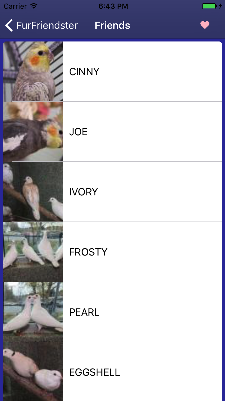
Your task for the first part of building this app is to create a big list of pets. Specifically, you’ll want your UI to look something like this.
For the most part you will be building this app on your own without any copy-and-paste guidance from us, but we are going to provide a few things.
Exercise: Get the starting files
FurFriendster is driven by the Petfinder API, and we have a pre-configured Angular service and a few model objects you can use to get the data you need. To install it run the following command:
npm i petfinder-angular-service --save
Alternatively (if npm install doesn’t work) you can open the workshop folder you’ve been working in today, and find its child app-challenge-files folder. Next, copy every file and folder in app-challenge-files, and paste them into your new FurFriendster app.
Eventually in this workshop you’ll allow users to filter which types of pets they’d like to see on the list page, but for now you’ll need to hardcode some really basic animal data.
On your list page you’ll need to call your new service’s findPets() method. Here is some data you can pass in for testing.
findPets("10001", {    // 10001 is the US zip code for New York City
  age: "",
  animal: "bird",      // you can replace this with "cat", "dog", etc
  breed: "",
  sex: "",
  size: ""
});
So now it’s time to get building. Here are your requirements for this part of the workshop.
Requirements
- 1: Show the list of pets returned from
findPetsusing a<ListView>UI component. - 2: Each entry in the
<ListView>should display the pet’s name and its image.
From there it’s up to you. Feel free to implement the design we show in this section’s screenshots, or to build something unique. If you get stuck here are a few tips you can refer to.
Tips
Tip #1: ListView
The NativeScript ListView documentation is available at https://docs.nativescript.org/angular/ui/list-view.html.
Setup your List
Make sure to start work in app.module.ts. You will need to import the NativeScriptHttpModule:
import { NativeScriptHttpClientModule } from 'nativescript-angular/http-client';
and include that in imports.
Likewise, import your petfinder service that you installed from npm:
import { PetFinderService } from "petfinder-angular-service";
and include it in your Providers.
Then, start your work in items.component.ts by importing the petfinder service and pet model.
Change items to pets and edit ngOnInit() with the new service call, returning a promise:
this.petService.findPets("10001", {
  age: "",
  animal: "bird",
  breed: "",
  sex: "",
  size: ""
})
.then(pets => this.pets = pets)
Then, get to work on the items.component.html file, editing the ListView to display the pets.
Tip #2: Images
Our service provides a convenience method for accessing the appropriate pet images. You can bind an <Image> tag using the following code.
[src]="item.media.getFirstImage(2, 'res://icon')"
Help loading external images
Note: You may encounter an error when loading images from external sources on iOS. To fix this, add the following code right under the initial
<dict>key inApp_Resources/iOS/Info.plist:
<key>NSAppTransportSecurity</key>
<dict>
  <key>NSExceptionDomains</key>
  <dict>
    <key>photos.petfinder.com</key>
    <dict>
      <key>NSExceptionAllowsInsecureHTTPLoads</key>
      <true/>
      <key>NSIncludesSubdomains</key>
      <true/>
    </dict>
  </dict>
</dict>
Hint: use a GridLayout within your ListView template to layout the image next to the label.
Tip #3: Styling
The NativeScript core theme has a few CSS class names for displaying thumbnail images. Check out https://docs.nativescript.org/ui/theme#listviews for details.
App Challenge Part 2 - Master-Detail Pages
With your basic list complete, your next test is to turn your list of pets into a functional master-detail interface.
What you’re building
The master-detail user interface pattern is a popular way to design mobile applications. Master-detail interfaces work best when you have a large list of some type of data, and the individual items in the list have details associated with them — details that the user needs to view or modify.
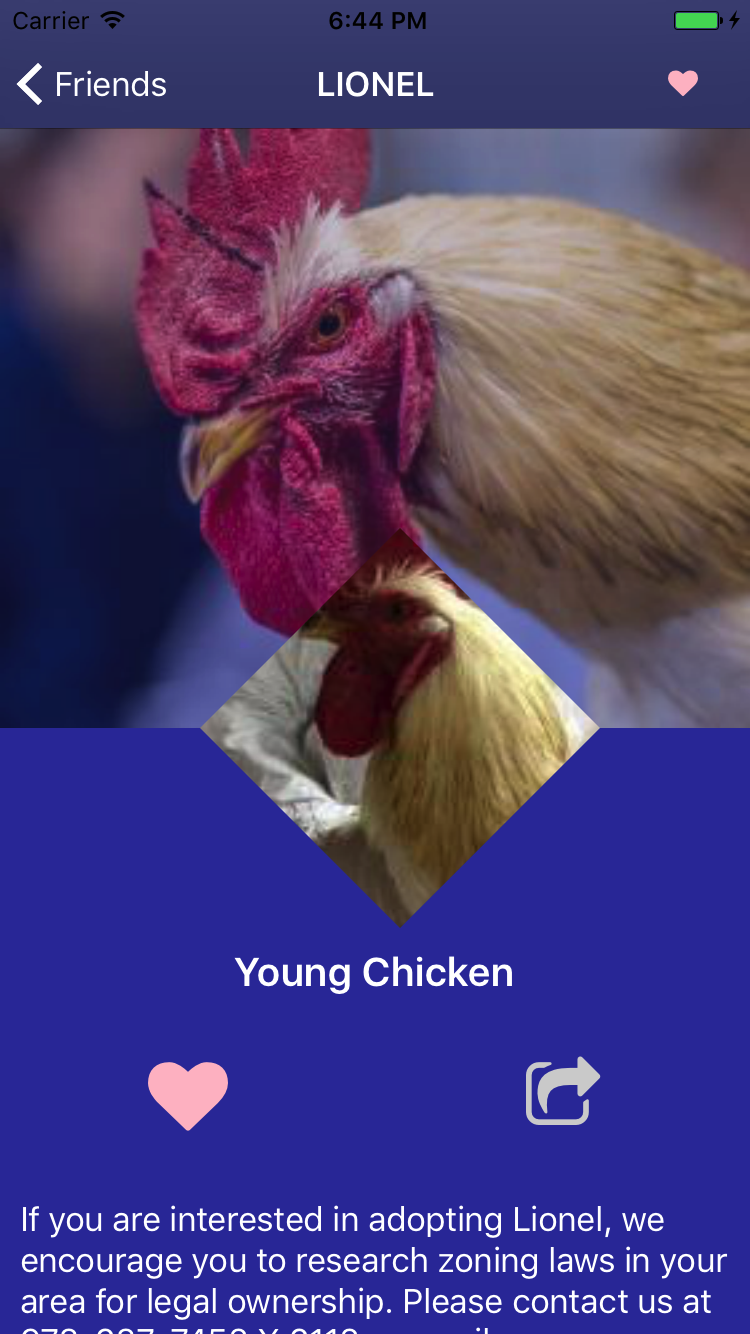
The Petfinder API provides exactly this information, so let’s put this user interface into practice with FurFriendster. After you complete this challenge, readers should be able to tap items on the master list of pets, and navigate to a second screen where they can see details about the pet they’re interested in.
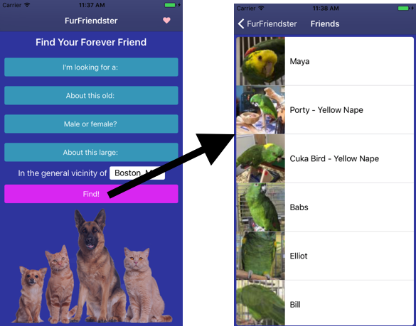
Here’s what your master-detail UI might look like after you complete this section.
Building the page
Your main task for this workshop will be figuring out how to add a new route to act as the details page, and how to pass data to that new page from the master page.
Don’t worry too much if your details page doesn’t look amazing. You main task is to show the appropriate data for each pet and get the navigation working. Here are the specific requirements for this part of the workshop.
Requirements
- 1. Show the following information for each pet on its details screen.
descriptionbreeds- Two images, which you can access by binding an
<Image>component’ssrcattribute to the following properties of aPetobject:media.getFirstImage(3, 'res://icon')andmedia.getSecondImage(4, 'res://icon').
- 2. Add the following two plugins to the details screen.
- Font Awesome
- After installing this plugin, download http://fontawesome.io/assets/font-awesome-4.7.0.zip, unzip the archive. Copy the archive’s
fontsfolder and paste it into yourappfolder. You’ll need those files for Font Awesome to work.
- After installing this plugin, download http://fontawesome.io/assets/font-awesome-4.7.0.zip, unzip the archive. Copy the archive’s
- Social Share
- You must allow users to share a pet’s description using the social share plugin.
- Font Awesome
Tips
Tip #1: clip-path
If you want to try to recreate the diamond shape images we used in our screenshots, give the CSS clip-path property a shot. You can use this tool to define your own custom shape.
Tip #2: Angular configuration
When adding your new route, make sure to add the appropriate entries to both your app.routing.ts and app.module.ts files.
Tip #3: ScrollView
If your UI components no longer fit on a user’s screen, add a <ScrollView> as a top-level UI component.
App Challenge Part 3 - Setting up a Form
With a master/detail interface complete, your app is almost ready to go. Your next step is to remove your hardcoded data, and let users filter and find exactly the pet they’re looking for.
What you’re building
In the third and final part of this challenge you’ll be building a third screen for your app. The app will be the new starting screen of your app, and will look something like the screenshot below.
Building the form
There are many different ways you can implement the filters that help users find specific pets. As a first step, start with a <TextField> for accepting a user’s location, and a <SegmentedBar> for allowing the user to choose between dogs and cats. Your task will then be passing that data from the form to the list page, so that the filters can be sent to the Petfinder API.
Here are the specific things you need to do.
Requirements
- 1: Build a form that allows the user to input the following data
- Pet type: “dog” or “cat”
- Location: Free-form text
- 2: Pass that data to your list screen, and only show pets that match the user-selected filters.
If you have extra time, there are a lot more filters you might want to implement. Check out the list of values in search-options.ts for a full list of values you can pass to the Petfinder API.
Tips
Tip #1: NativeScriptFormsModule
Since your app now has a form, you need to include the following import in your app.module.ts file.
import { NativeScriptFormsModule } from "nativescript-angular/forms";
And then include NativeScriptFormsModule in the imports array of your main NgModule.
Tip #2: SegmentedBar
The easiest way to implement radio-button-like controls in native apps is with SegmentedBars. Here are the docs on how to use them in NativeScript
App Challenge Part 4 - EXTRA BONUS TIME
Have you completed all requirements of the app challenge and still have time left? Good news! There’s still more fun to be had.
Take whatever time you have left and implement a new feature for FurFriendster. Use your imagination! What feature does the best pet finding app on the market really need?
If you’re having trouble coming up with good ideas, we have a few suggestions.
- Adding favorites
- Allow users to heart or start their favorite pets, and show those favorites in a new screen in your app.
- A new theme
- Try a different color scheme to give your app a whole new look.
- Random pet
- Give the user a way of seeing for a random pet.
Where to go from here?
Congratulations! You’ve completed the NativeScript workshop 🎉
Regardless of what you choose to do with NativeScript, joining the NativeScript community is a great way to keep up with the latest and greatest in the NativeScript world. Here are some ways you can get involved:
- Post on the NativeScript Community Forums. If you have a problem or a question, post it here.
- Join the NativeScript Community Slack. The community Slack is a great place to chat with others in the NativeScript community.
- Follow @nativescript on Twitter for updates on all things NativeScript.
- Sign up for the NativeScript newsletter. The newsletter will deliver NativeScript articles, news, plugin updates, and more straight to your inbox.